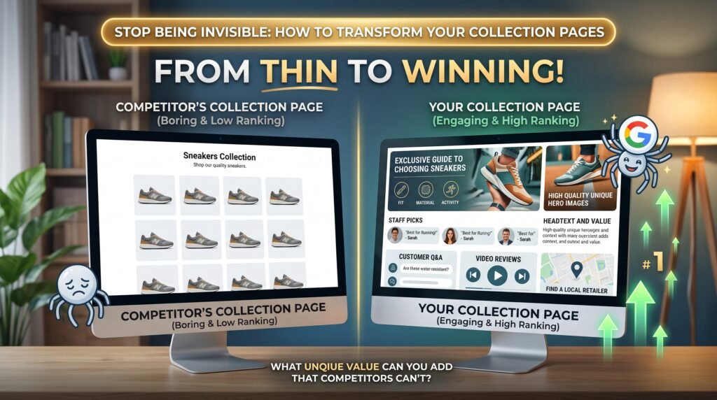
Collection pages are where the money is. Somebody searching for a product type rather than a specific product is closer to buying than a blog reader and less decided than somebody searching your brand. That search lands on a category page.
They’re also, on a lot of the stores I look at, the thinnest pages on the site: a grid of products, a heading, and maybe one line underneath. This is about what to do instead.
The problem isn’t the page, it’s what it asks Google to prefer
Your competitor sells the same products, sourced from the same suppliers, with the same photographs. If your page and theirs both amount to a product grid with a title, there’s no basis on which to prefer either.
So the question isn’t how to optimise the page. It’s what you can put on it that the other store can’t, or won’t.
That rules out a lot of what gets written into category copy: a paragraph restating the category name, a sentence about quality and service, a keyword-stuffed block at the bottom that nobody reads. All of that is available to your competitor too, and it doesn’t help a shopper.
What actually belongs there
Think about what somebody genuinely needs in order to choose between fifteen similar products, because that’s the job the page is failing.
The difference between the options. If you sell four grades of the same thing, say what separates them and who each suits. This is the single most useful thing on most category pages and the most commonly missing.
How to choose the right one. Sizing, compatibility, what it fits, what it doesn’t, what people get wrong and return. You know the answers because you handle the returns.
The questions you get asked. Your customer service inbox is the brief. Whatever comes up repeatedly before people buy belongs on the page they buy from, not buried in a blog post or an FAQ page somewhere else.
Where it sits against the alternatives. Being honest that a cheaper option is fine for occasional use builds more confidence than pushing everybody to the expensive one.
None of that is written for Google. It happens to be what Google is looking for, because it’s what a shopper is looking for.
Where to put it without wrecking the page
The usual objection is that nobody wants to scroll past 600 words to reach the products, and that’s fair.
A short, genuinely useful introduction above the grid, two or three sentences that help somebody orient themselves, then the products, then the longer guidance below. That order respects the shopper who already knows what they want and serves the one who doesn’t.
What I’d avoid is the block of text under the fold that exists only for search engines. It’s usually obvious, it’s rarely read, and it’s the kind of content Google has been explicit about not rewarding.
The structural things worth checking while you’re there
Filters and sort options that generate crawlable URLs, creating dozens of near-duplicate pages from one collection.
Pagination, where page two onwards either isn’t reachable or is competing with page one.
Internal links, particularly whether your navigation and your product pages point at the collection you actually want ranking, or at three variations of it.
Empty or near-empty collections that exist because somebody created them once. They dilute instead of helping.
On Shopify there’s a specific one: products are reachable at both /products/ and /collections/[collection]/products/ addresses, and while the canonical usually handles it, themes, apps and internal links can undo that. More on the platform specifics on the Shopify SEO page, and the WooCommerce equivalents on WooCommerce SEO.
How to decide which collections to do first
Not all of them, and not alphabetically.
Take your top collections by revenue, then look at what they currently earn from search in Search Console. The ones with impressions but poor click-through are already being shown and rejected, which is usually a title and page quality problem, not a ranking one. The ones with neither are a bigger job.
Start with two. Do them properly, give it time, and see what moves before committing to forty.
What this looks like when it works
A category page that reads like it was written by somebody who sells the products, because it was. It answers what people ask, it’s honest about which option suits which situation, and it gives a shopper a reason to buy from you rather than from whoever else stocks the same thing.
That’s harder than installing an app and it’s the part that actually compounds.
If you want someone to look at yours, the ecommerce page covers how I work with stores, or request a free assessment.
Questions people ask
How much text does a collection page need?
There isn’t a number, and anyone giving you one is guessing. The test is whether somebody choosing between your products would find it useful. Two hundred words that answer the real question beat eight hundred that restate the category name.
Should the content go above or below the products?
A short orientation above, the detail below. Making a shopper scroll past an essay to reach what they came for costs you sales, and the page has to work for people who already know what they want.
Do I need unique content on every collection?
On the ones that matter commercially, yes. On the long tail of small collections, it’s often better to question whether they should exist at all than to write filler for them.
What about filters creating extra pages?
Worth checking on any store. Faceted navigation can generate large numbers of crawlable, near-duplicate URLs. Whether that’s currently a problem for you is visible in Search Console’s page indexing report.
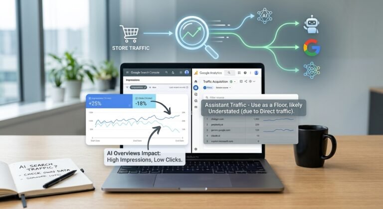
Will AI answers change this?
Possibly, and the same content helps. Pages that explain differences and answer real questions are what both shoppers and AI systems draw on. There’s more on measuring that in is AI search taking your store’s traffic.